Wednesday, May 3, 2017

Final Project

For my final art project, I interpreted what Norbert Goeneutte would have maybe done today if he were still alive. I took his everyday life aspect and impressionist techniques and combined the two to make a contemporary piece of work. For everyday life, I found photos of coffee shops including a barista bar and people sitting on their computers doing work. Then I took these photos and put them into Photoshop. Here I was able to create a layer for both pictures and color match his painting View of St Lazare Railway Station, Paris (posted below). Then I made the resolution 150 and went to filters to add the oil paint layer. I played around with the texture I wanted until I found the perfect medium. This part incorporated the impressionist techniques of showing thin, light brush strokes with an undone look to it (since from my research I found most works look unfinished). I then added a 3D feel to have the people pop out as well as the bar. I wanted to the people with computers to stand out because I felt this truly showed the modern day look of every day life you could see. It is rare to walk into a place today or even outside and not see someone using technology. I also added paint to the border of the pictures to create more texture and show the brush stroke technique used during the impressionism movement. Lastly, I incorporated little white Christmas lights to display light. I struggled with this idea at first because I was unsure how to show the natural lighting that Goeneutte displayed in all his pieces. I felt that by stringing actually lights around the picture would not only show the light I wanted, but also add to the contemporary feel. Overall the underlying meaning of this picture is that even in a place such as a coffee shop, which was once for meeting up with people and catching up or just relaxing and enjoying a coffee, people are so consumed by technology that they no longer sit back and relax.

Visual Analysis 
1. Focal Point / Eye Path: The focal point here is the barista bar and then the eye path is intended to go down to the people on their computers. Both of these aspects are 3D and therefore guide the eye.
2. Implied Line: The implied lines were formed with the 3D aspect because it is no longer attached to the paper directly; the eye has to imagine it is meant to be there.
3. Actual & Implied Texture: The implied texture in this piece was from Photoshop as described above. It has an oil paint filter in order to display impressionist techniques of light, thing brush strokes. I also added paints with visible brush strokes on the border to add more texture.
4. Color Schemes: Monochromatic; mostly consisting of different shades of brownish yellows
5. Format: Picture, Photoshop, Vertical Landscape
6. Composition Terminology: Paper with Photoshop pictures glued down to it as well as lights strung around the paper and paint.
7. Scale: A sheet of Bristol Pad paper
8. Connotative, Denotative, Ideological Meaning: The denotative meaning in this picture is people sitting on their laptops in a coffee shop during the daytime. The connotative and ideological meaning here is that everyone loves to go to coffee shops today but it no longer is to relax. Sometimes it still appears to be this way, but more often than not people are sitting on their laptops or cellphones away from what is going on around them. People no longer can just sit and relax while enjoying a cup of coffee, but rather are always invested in their technology that consumes their lives.  
"View of St Lazare 
Railway Station, Paris" by Norbert Goeneutte


Final Thoughts
I enjoyed learning more about art this semester. I am always surrounded by it because my sister is a very artistic person. To be able to try and incorporate my own ideas was definitely a learning experience. Having a vision in your head is a lot different once you are trying to put it on paper. I found that was the most difficult part for me. If I were to change something about this class it would be to not write an essay. I thought the presentation portion was enough for me to really understand my artist and see what techniques he used and why he used them. Other than that, I felt that all the projects we did taught me a new technique and I learned a lot about texture and visual concepts. I hadn’t really ever thought about these things when thinking of how an artist incorporates materials into their works. 


Tuesday, April 11, 2017

Post Modern Project - Visual Analysis


"We live in a world where there is more and more information, and less and less meaning."

This picture consists of the earth combined with a person with a cellphone for a head, hands holding the earth up and numbers as the background. The outline of the project has the color yellow, green and blue. My color scheme for this project was analogous and I chose to utilize the colors represented in the earth as my main focus. I then glued down an accordion style that overlaps onto the main focus of the piece. This was put here in order to represent the how much information gets fed into everyday life. The cellphone-head shows that our minds are filled with technological information as well.

The connotative meaning here is that everyone becomes so consumed with the data and information they are represented with that people eventually just turn into it. The numbers on the accordion going into the center is also showing data feeding into people. This piece is meant to look as though a lot is going on because that is representing the information consistency aspect. It is constantly filtering into people's everyday life that everyone relies off information and technology to live. 

Tuesday, March 28, 2017

Postmodernism

Postmodernism

  • People in the past did not cross cultures...they only lived one way of life
  • There is no more ONE morality, ritual, concepts, belief system
  • New communications have developed that allow for people to be connected no matter where they are in the world
  • Jean Baudrillard's concept of Disney
    • Explains that Disney is an imaginary world where people can go to escape
      • Adults have the ability to act like children
      • Every concept of Disney appears to be a fantasy
    • Baudrillard explains that maybe reality is not as realistic as people would think
    • Disney creates a disguise and causes people to believe that their reality is true reality 
    • Relates what people believe to be true reality to a simulation
    • Compares actual prisons to life BEING a prison

Monday, March 27, 2017

The Shape of Time - George Kubler

In "The Shape of Time", George Kubler discusses the aspect that "...in short tall materials worked by human hands under the guidance of connected ideas developed in temporal sequence"(8). This stood out to me the most because to me it meant that everyone's inspiration comes from what they see and feel in life. Although artists convey these emotions in different variations, they tend to be very relatable. He then goes on to talk about how everyone has a "collective identity". This too a different way of thinking about art and life combined. Everyone does view matters differently based on their culture and where they come from. Having a "collective identity" made me realize that even when art may be challenging to understand, every artist is coming from events that have happened in their lives. Therefore, every viewer has the ability to understand, relate, or sympathize with what the artist was trying to convey even it does not immediately make any sense. Kubler also talked about how a person can shift tradition in order to find a better entrance. He made this point in order to show that not every period of time has to have one specific focus. Artists have the ability to come in and change how art is "supposed" to be done based on their own creativity and emotions.  

Saturday, March 25, 2017

Fractured Histories - Gallery Visit

During my visit to the Fractured Histories gallery opening I found the pottery in the room to be very intriguing. The ancient Greeks used to depict many of their beliefs and rituals onto these works of art. Not only were they created for purposeful reasons but also as a symbol of what they believed in. 
The pottery that stuck out to the me the most was the one pictured below:

At first I didn't think much of it until I got a closer look. The bottom of this vessel has two eyes. These eyes in Greek culture are said to ward off evil. I found this to be meaningful to me because I wear a hamsa necklace everyday. On the hamsa necklace it is a hand with an eye in the middle of it. This is to symbolize the hand fending off jealousy and the evil eye. In a similar sense the eyes on this vessel are also doing the same but just in a different culture. It is always cool to see that ancient history and modern day beliefs can still coincide. You still see this eye in the above picture on peoples necklaces, bracelets, keychains, etc. and it still means protection from evil. Similarly I wear the hamsa necklace for the same meaning. 

Tuesday, March 14, 2017

Data Visualization

I found the post interesting part of the Data Visualization video to be when he said that "people are using visualization today to do something". This stuck out to me because data is a huge aspect of life today. Almost everything we do has a system of data. The video also went on to talk about how the creator can have a different reason for creating the data visualization than how the view is going to perceive it. 

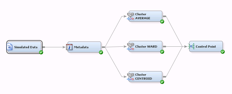
I was able to relate this video to a class I took last semester called Data Mining. Our final assignment was to take this massive amount of data on SAS and choose key variables to analyze. The data was on a grocery store and its various locations throughout the United States. You may never think that your local grocery store is processing data, but in fact it is taking into account many things you are doing while there. These include: scanning items, which brands people are buying the most, how much money is being spent, what type of payment is being used...etc. From there we created a data visualization on the variables we felt were most important to the store in order to better their profits. 

Below is a picture of what the data visualization I described above can look like:
Image result for SAS data nodes

It is interesting to think that data can be used with almost anything, but it is also important how it is presented as well. The video also referred to data visualization as creating a story. This also stuck with me because if there isn't a clear objective or narrative then it will not make any sense to the viewer. Just how typical artwork conveys a message, so does data but just in the form of numbers, shapes, lines etc that all connect into a story about the particular subject.

Sunday, February 26, 2017

Whitescapes


The picture on the left is a white mug on top of a white refrigerator with the lights off. The picture on the right are the same two objects with the lights on.

The photo on the left: With the lights off the refrigerator appears to be a grey mixed with white. The mug here appears to be even more white where the light hits against the shadows that are forming from the lights being off.
The photo on the right: The refrigerator has a cool white that almost appears blue. The mug here looks like warmer more vibrant white.